

What is our fundamental tool for communication? Writers will say letters and words are the obvious answer but in graphic design the visual study of words is called “Typography.” We won't unpack the whole definition; essentially, it’s choosing the right combinations of type, color, size and format to create an arresting and effective visual that draws the viewer into your message. For the New Mexico True brand, we’ve done much of the legwork to create colors and typefaces that are consistent and have proven to be effective in communicating our brand essence.
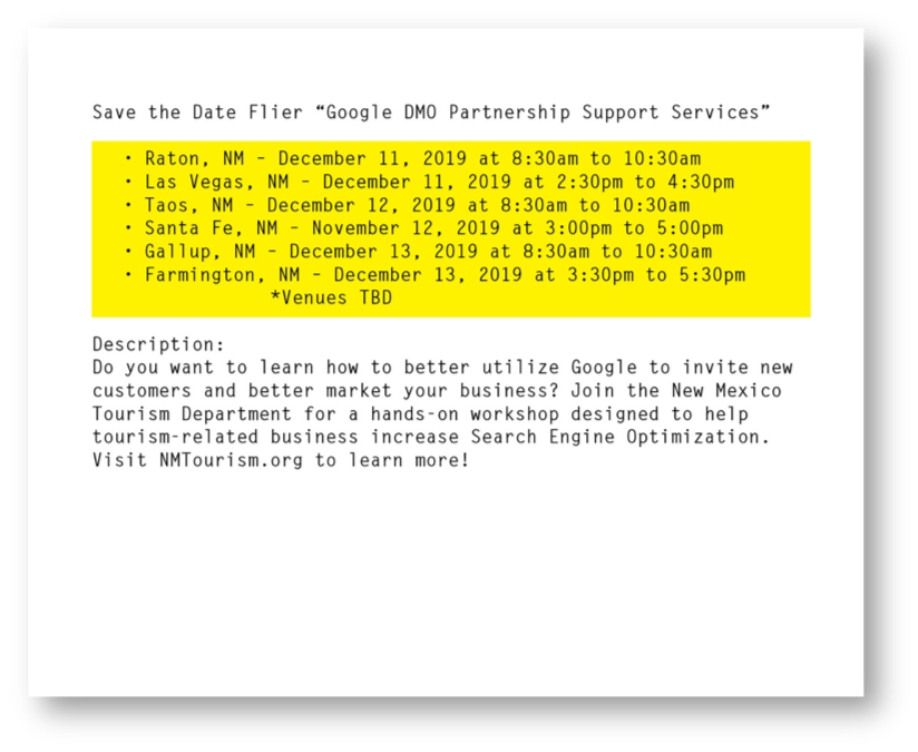
To make this less theoretical, I'm going to use a recent example (and do a little guerilla marketing for some workshops we’re planning). I received the following plain text email from my co-worker. In this exercise, I first ask myself, what is the information that needs to be conveyed to our readers and how can I logically group together content blocks.
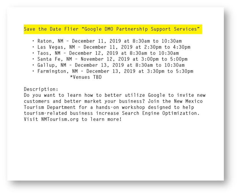
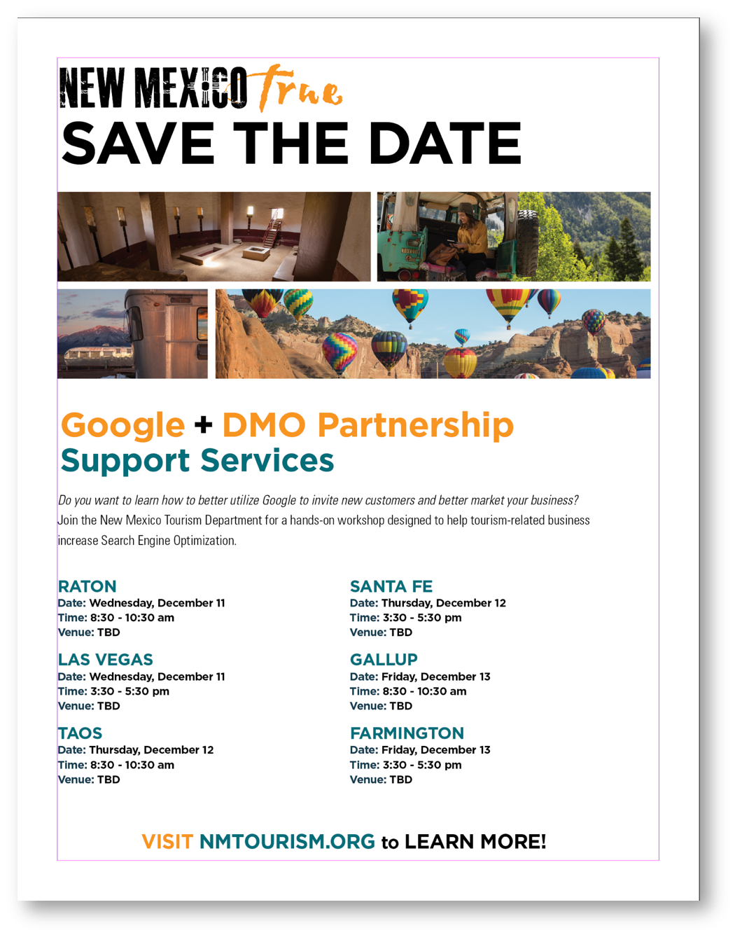
I start by thinking about Typography and Type Hierarchy, a tool of the trade used to format type that organizes and focuses attention based on levels of importance. My first task in formatting the message is to pull out the most important information. In this case, we're working with a "Save the Date" event flier for Google DMO Partnership Support Services. Although the event name is important, typographically speaking, it takes a back seat to the most important piece of information which is saving the date. So, I construct the header of the flier like this…
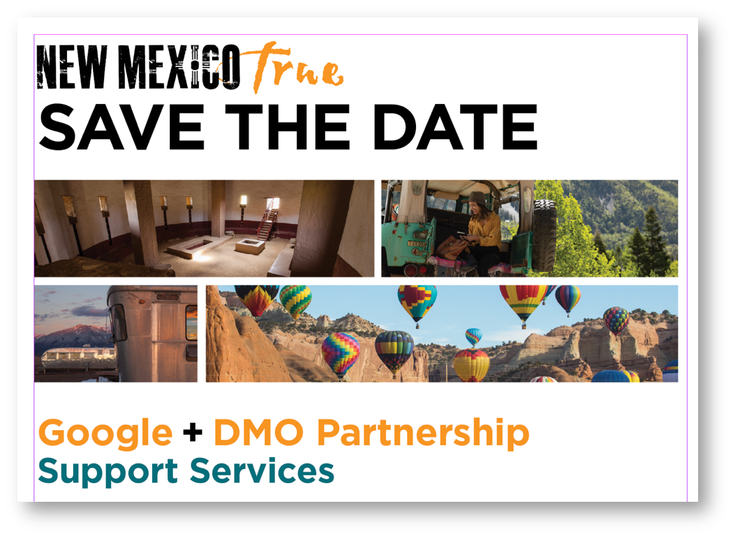
taking care to use our colors and various, though not extreme, sizes of type to accentuate parts of the headlines. We don't want everything to get visually lumped together. Adding photos helps break up large blocks of text – even in a header this can work to your advantage when you have multiple points of emphasis. It definitely helps capture the viewer’s attention as well!
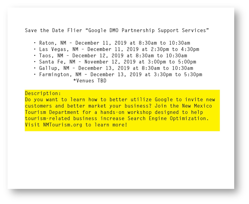
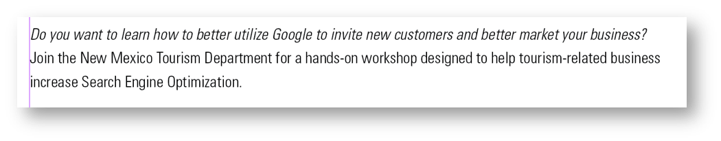
Next level of importance falls to the description of the event. Because the eye naturally moves down and it's placed immediately following the headline, not as much visual emphasis is needed. Simple, legible copy type will work, perhaps using italics or a slightly heavier type for a little emphasis on the question.
Lastly, we come to dates, times and locations. This is the next logical step in the readers' train of thought once they've identified what the event is, that it's for them, and now they're ready to know where and when to participate!
As you can see there’s a lot of redundancy in how this information was originally given, so certain pieces can probably be left out to simplify and clean up the information. Always think of the end viewer and remember that it's our job to create the easiest path to understanding. Finally, we want to pull together the entire document with a highly visible call to action, bookending the flier with a strong, colorful typeface that gives the reader a clear path to the next step of engagement.
Keeping all these logical steps in mind is the key to any piece you may be working on! First distill every piece of collateral down into its components. There's always going to be a hierarchy of information and your goal as the designer is to choose the best way to translate that into a graphically engaging and informative piece. Be aware of colors and sizes to help elevate or lower the visual draw of a particular elements and always keep things as clean and concise as possible. In this way, you'll be able to convey exactly what your audience needs to know.
I hope this has been helpful! Sometimes just seeing these seemingly obvious pieces broken down into logical steps can be a great way to examine how we construct informational and advertorial pieces that best communicate with our audience.